Geographic Information Systems
Gregory E. Glass
A common definition of geographic information systems (GIS) is that they are procedures to input, store, retrieve, manipulate, analyze, and output data that have spatial attributes associated with them.1 Typically, the results are presented as maps or images that summarize the data or analyses performed on the data. Infectious disease epidemiology, almost by the very nature of the interaction of hosts and the pathogens within the environment (as well as vector and reservoir populations with vector-borne and zoonotic diseases), lends itself to GIS analysis, at least as a way to summarize the sometimes complex relationships associated with disease transmission.
Snow’s classic study of cholera transmission around Broad Street in London in the mid-1850s is often summarized by referring to the map of deaths he plotted in relation to the Broad Street pump, as well as the pump’s spatial relationship to other features such as workhouses, residences, and factories (Figure 7-1). As such, the manual construction of a map to present these data conforms to the definition of a GIS. Despite the convincing nature of the data when presented in this way, it is critical to keep in mind an important feature of Snow’s analysis that generally characterizes the limited application of GIS in epidemiology: The map that he created did not lead him to conclude that (1) cholera was a waterborne illness and (2) the pump was the source of contagion (contrary to popular lore); rather, the map was a method that he used to summarize his data to his audience and a tool he used to try to convince others of his conclusions. As Vandenbroucke2 recently noted, “As an historical example, it remains important to remember that Snow’s theory on the communication of cholera was not derived from his epidemiologic observations, but preceded them.” Although Snow applied the tool of GIS well, it was a relatively restricted application. The restriction has been due, historically, to technical limitations rather than to conceptual ones.
Although the spatial distribution of cases is recognized as important in understanding infectious disease transmission, the statistical and geographic tools have not been generally available to make the examination of spatial distributions of infectious diseases an important analytical method for epidemiologic investigations. The increased development of GIS as an analytical approach in epidemiology results from improved access to computer systems and their associated software. To date, most of the progress in spatial epidemiology has been made where point exposures to a single factor (e.g., a pollutant or radiation) are responsible for human disease. An analogous situation occurs during outbreak investigations that involve a single source of infection. Although the graphical presentation of these data is little removed from Snow’s early representations, demonstrating the spatial consequences of epidemiologic processes deduced from more traditional means can be compelling.
For example, in 1979, an outbreak of anthrax was reported from the Sverdlovsk region in Russia involving deaths of both humans and domestic animals. Occasional anthrax outbreaks had been known from that region since at least the early 1900s. Anthrax is a disease caused by infection with Bacillus anthracis, and the severity of the disease caused by infection varies with the route of exposure. Cutaneous infection is least likely to cause mortality, whereas ingesting contaminated meat has a higher rate of mortality and inhalation of the agent is usually fatal. Official reports of the investigation indicated the 1979 outbreak was associated with contact with naturally infected animals. However, rumors persisted that the outbreak was related to an accidental release of bacteria from a military facility.
Subsequent epidemiologic investigations, summarized by Meselson et al.3 with the mapping of human and animal cases, indicated both the locations and the timing (based on meteorologic conditions) were immediately downwind of the military facility. Furthermore, examination of autopsy materials confirmed the human cases resulted from inhalation rather than ingestion of the bacteria. Therefore, the cause of this outbreak was due to an aerosol containing anthrax organisms generated by the military facility, as subsequently concluded by Prime Minster Boris Yeltsin.
Subsequent epidemiologic investigations, summarized by Meselson et al.3 with the mapping of human and animal cases, indicated both the locations and the timing (based on meteorologic conditions) were immediately downwind of the military facility. Furthermore, examination of autopsy materials confirmed the human cases resulted from inhalation rather than ingestion of the bacteria. Therefore, the cause of this outbreak was due to an aerosol containing anthrax organisms generated by the military facility, as subsequently concluded by Prime Minster Boris Yeltsin.
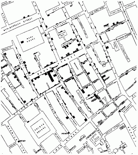 Figure 7-1 Map of the cholera outbreak in London around Golden Square and the Broad Street pump, indicating deaths, the pumps in the vicinity, and various land use features as drafted by John Snow. Courtesy of The Commonwealth Fund. In “Snow on Cholera” by John Snow, Commonwealth Fund: New York, 1936. |
Probably one of the most striking early examples that moved beyond simple graphic representation and demonstrated the power of examining spatial patterns in infectious diseases was Maxcy’s4 implication of rodent arthropod vectors in the transmission of murine typhus. Comparison of the spatial distributions of typhus cases in Montgomery, Alabama, from 1922 to 1925, based on places of residence and places of occupation, showed substantial aggregation by place of occupation rather than residence. Thus the differences in the spatial distributions of cases by alternative places of exposure provided a means to evaluate different epidemiologic hypotheses. Maxcy hypothesized that if human lice served as vectors of typhus (as was assumed by many people at that time), then multiple cases should occur in and around the same household because of close human contact. In reality, spatial clustering of cases was more evident when place of occupation was examined (Figure 7-2); typhus was especially common among workers associated with food services, leading Maxcy to propose that an arthropod vector associated with food services was responsible. Subsequent work5 showed the vector of murine typhus to be the rat flea, whose hosts infested many of the food facilities at that time.
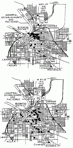 Figure 7-2 The distribution of cases of typhus fever in Montgomery, Alabama plotted by K. F. Maxcy in 1926. Top shows distribution of cases by place of work (or residence if unemployed); bottom by place of residence. The more focal distribution of cases by place of work (top) was used by Maxcy to infer that endemic typhus was not transmitted by lice. Reproduced from Maxcy, KF. 1926. An epidemiological study of endemic typhus (Brill’s disease) in the Southeastern United States with special reference to its mode of transmission. Pub Health Rep. 41:2967-2995. |
Clearly, one factor limiting the use of spatial data in earlier times was the methodological difficulties associated with manipulating spatial data. The problem with manually plotting information, such as Maxcy’s data, multiplies significantly with each environmental factor examined, the spatial (and temporal) relationships of these factors, and the epidemiologic associations to be evaluated. These difficulties have been greatly reduced by the widespread introduction of relatively powerful computing systems in epidemiologic research and the development of dedicated GIS software that is designed to perform functions associated with mapping spatial data. When coupled with spatial analytic methods that have developed during the past two decades, it seems that we may be able to use the spatial patterns of infectious diseases in an analytical fashion, rather than intuitively, to provide important clues to the epidemiology of infectious diseases. This is true even when multiple environmental factors interact to influence disease rates. The most intriguing possibility linked to these systems is that they might allow us to develop and
test hypotheses about infectious disease epidemiology in ways that have previously been unfeasible.
test hypotheses about infectious disease epidemiology in ways that have previously been unfeasible.
This chapter provides an overview of GIS, with its structure discussed in functional terms. The influence of computer systems on the field means that many software systems have been developed to apply to spatial data, each with its own limitations. The field of GIS is rapidly growing and various textbooks exist as introductions to the methods and approaches of the technology.6, 7 Thus, after the brief overview of GIS, the rest of the chapter contains discussion of each of the major applications of GIS as they apply to infectious disease epidemiology. A series of case studies, from simple situations involving data storage through analysis and decision making, are provided. These examples represent studies that will provide some ideas of the broad scope of the technology’s application.
OVERVIEW
Geographic information systems can be used for a variety of purposes in infectious disease epidemiology, and these functions are fairly general to any field using spatial data. In a broad sense, GIS can be used to help collect and store data, manage data, query data, model the processes generating data, and make programmatic decisions. It is important to realize that the latter tasks, especially modeling and decision making, are not independent of the earlier functions; the quality of modeling, for example, is critically influenced by how well data have been collected and managed.
An excellent recent synopsis of GIS can be found in the article by Vine et al.8 Briefly, a major feature that distinguishes GIS from other computer-based systems is that GIS contain within the stored data information concerning the spatial relationships among geographic features, and provide methods to study the relationships among selected, relevant features. Two major formats are used to represent these features: vector format and raster format. Software systems tend to be predominantly one or the other, but more recent versions usually provide algorithms for alternating between formats.
Vector Format
Vector-format GIS represent features in two-dimensional space as points, lines, or polygons, whereas raster-format GIS represent features in twodimensional space in (usually) a uniform grid. Other data formats, such as quadtrees, which are something of a hybrid format, also exist but are generally less commonly used.
The major conceptual difference between vectorand raster-based systems relates to how the data are represented. In vector format, points are located by specific x, y coordinates that typically represent a specific place on the earth’s surface. Lines are interconnected points, linked one to another, whereas polygons represent features with areas and are joined line segments in which the first and last points have the same coordinates. These three types of features— points, lines, and polygons—are used to represent objects on a map. For example, points might be used to indicate the location of healthcare facilities, lines might be used to represent transportation networks (e.g., roads), and polygons might be used to indicate the geographic extent of service areas for the clinics. In vector formats, these elements are usually thought of as being fairly precisely located and, in the case of polygons, the area to the inside of the polygon’s boundary is assumed to be homogeneous. These assumptions are only approximately true for most environmental features, however, which raises an issue of data quality that must be assessed in any analysis.
How objects are represented in vector format depends on the scale at which the data are gathered. For example, a clinic might be presented as a point at one scale; in contrast, as one moves to a larger scale (zooms in), floor plans and the outside walls of the buildings making up the clinic might be best represented by polygons. Issues related to choice of scale for GIS application are critical to the study design and outcome. The choice of scale, to some extent, is often determined by the initial resolution of the epidemiologic data. Consider, for example, that Lyme disease, a tick-borne bacterial infection, is a nationally reportable disease in the United States. However, the summary data may be available only at a state or, at best, county level. Consequently, the scale for the GIS applications of the problem may be no better than county resolution, with cases known to occur somewhere within the county boundary. A fairly small scale is most appropriate for presentation of these data, and it places limits on the types of questions that can be addressed. In properly maintained databases, the minimal mapping unit (or the extent of smallest feature identified) is indicated, which is an important consideration in the selection of databases for study.
Raster Format
Raster formats are typically represented as grids of a study area, and locations are determined by the row
and column locations much like a Cartesian coordinate system so that each x, y coordinate represents the location of a cell. Probably the most obvious example of raster-based data is satellite imagery, in which reflected light from the earth is recorded by sensors on the satellite. The brightness of the reflected light is recorded for an area of the earth’s surface. This area represents the spatial resolution of the image. No points or lines are used in raster formats, as all features have some minimal area assigned to them. Additionally, polygons, such as are used in vector formats, do not exist per se but rather are represented by large numbers of adjacent cells with the same data value.
and column locations much like a Cartesian coordinate system so that each x, y coordinate represents the location of a cell. Probably the most obvious example of raster-based data is satellite imagery, in which reflected light from the earth is recorded by sensors on the satellite. The brightness of the reflected light is recorded for an area of the earth’s surface. This area represents the spatial resolution of the image. No points or lines are used in raster formats, as all features have some minimal area assigned to them. Additionally, polygons, such as are used in vector formats, do not exist per se but rather are represented by large numbers of adjacent cells with the same data value.
This data format has two consequences in GIS. First, the locations of points, lines, and boundaries of areas are approximate, in that they are located somewhere within the specified cells but their precise locations are not identified. Thus the locations of features are somewhat “fuzzy”—which may be more realistic for natural features, such as habitat edges. Spatial accuracy of raster features is determined by the spatial resolution of the grid. The raster format sometimes provides a more detailed characterization of features in the inside of regions than vector formats, which assume features are uniform within a polygon.
Second, because the spatial resolution is determined by the interval distances between the rows and columns, the shorter the intervals, the finer the resolution. This produces a computational tradeoff between improved spatial resolution, which is achieved by increasing the numbers of rows and columns, and the size of the database. Unlike in the vector format, the data value for each cell has to be recorded in the raster format. To minimize the sizes of files and the time needed to process data, various methods of data encoding have been developed in an effort to reduce the computational loads associated with raster formats.
Data Structure
The development of relational databases, in which different databases can be linked by a common key field, represented a major contribution to integrating GIS within infectious disease epidemiology. Relational database structures make it possible to use GIS as a tool within a larger, investigative analysis, rather than forcing studies to adhere to specified data frameworks.
Data Sources
Data for GIS can be derived from a variety of sources, both specifically for study (e.g., survey data) and as part of the regular duties of agencies (administrative data). As long as at least one of the variables in the gathered data can be linked to a geographic location (e.g., postal codes, addresses, census tracts, states, provinces, countries), the information can be incorporated into a GIS.
More typically, studies derive information from both administrative and specific study design sources. Information on environmental conditions (e.g., land-use or land-cover patterns, property ownership patterns, soils, watersheds) can be accessed from appropriate governmental agencies that gather such data as part of their administrative responsibilities. The resulting data can form a portion of the analysis, whereas specific survey data to study disease incidence, morbidity patterns, and so forth can be gathered as part of a specific study by investigators, who then attempt to link observed disease patterns with the spatial distribution of environmental covariates.
Remotely sensed information is a source of accurate, updated data for environmental analyses. Such information can be gathered from a variety of sources, such as airplanes, for survey studies, although most current sources that have a nearly administrative purpose rely on remotely sensed data recorded from satellites. Many different satellite platforms are actively gathering data today; they vary in their spatial resolution, temporal resolution, duration of data gathering, and the portions of the electromagnetic spectrum that are scanned. For example, the current Landsat Thematic Mapper platform surveys each region of the earth every 16 days. It scans in seven regions (bands) of the electromagnetic spectrum—three in the visible portion and four in the infrared region, with a spatial resolution of approximately 30 m. By contrast, the Advanced Very High Resolution Radiometer (AVHRR) system surveys each region twice daily, scanning in five bands of the electromagnetic spectrum, with a spatial resolution of 1.1 km.
Analysis of archived satellite imagery is a useful method to examine changes in environmental conditions over time or to review environmental conditions at the times of previous disease outbreaks. The choice of satellite data is influenced by both the time when the epidemiologic data were gathered and the spatial and temporal resolution needed for the environmental data. Interpretation of the satellite imagery—or any remotely sensed data, for that matter—can be a difficult task and requires substantial training. Thus, in GIS, the remotely sensed data serve as an updated data source on environmental conditions, but the quality of the interpretation relies on skills and techniques outside of GIS.9
Data Quality
Data quality, especially when those data were not gathered directly by the investigators, is a substantial, often ignored issue. Epidemiologists often encounter misclassification errors associated with attribution problems (false-positive and false-negative findings); however, four additional sources of error can be overlooked in GIS analyses: spatial, resolution, interpretive, and temporal errors.
Spatial errors involve misplacement of mapped features relative to their locations in the coordinate system. These errors can occur from simple data entry mistakes or from the methods used to locate the mapped features. One example of spatial errors introduced by the methodology used concerns address-matching algorithms that rely on digitized street maps. Digitized street map databases in vector formats often use an “arc-node” design to code information, where street intersections are nodes and the streets are the arcs. The numbering of the buildings is not done by actually locating each property boundary; instead, the “even” and “odd” sides of the streets are indicated in the file and the possible range of addresses is given. The geographic location of a residence is then determined by the linear interpolation of the building number relative to the range of numbers for the street.
Errors introduced by this coding method can be striking in some areas where block numbers have specific local meaning. In Baltimore, Maryland, blocks north and south of Baltimore Street are numbered in 100s north or south (e.g., 600 block of North Wolfe Street). At the intersection, the block changes in units of 100. Even if only 10 buildings, numbered 600 through 618 occupy one side of a block, on the next block the first building is numbered 700. Thus, with the arc-node format, all of the buildings will be mapped within the lower one fifth of each block even though they cover its entire length. If the spatial resolution of the study is not too fine, this error can be relatively insignificant; however, if exposures need to be specified with a high degree of spatial accuracy, the error could be substantial. Regardless, such errors need to be identified and empirically evaluated for each study.
Resolution errors can occur because the databases that make up the GIS inherently have some level of spatial resolution, or detail. This is sometimes known as a minimal mapping unit. That is, because of limitations related to resources or space, the databases are abstractions of the real world they represent. For example, a database of forest boundaries rarely, if ever, shows the exact location of each tree in the forest; rather, the edge of the forest is approximated to some level of resolution. In addition, open spaces in the forest that support small meadows or grasslands may not be shown if these open spaces are too small (i.e., they are smaller than the minimal mapping unit). This abstraction is necessary but can limit the usefulness of a particular database for a specific study. Even if every environmental feature, such as each tree, could be located, epidemiologic investigations of infectious diseases rarely have sufficient accuracy themselves to make such detail meaningful. Consider Lyme disease, a bacterial infection transmitted by small, hard-bodied ticks. Clearly, an epidemiologic investigation that attempts to identify environmental risk factors of the disease requires identifying places of exposures for cases. However, the ticks associated with most disease transmission in the eastern United States are so small that only a few individuals can accurately identify where or when exposure occurred to any useful level of accuracy. Many people do not even recall getting tick bites.
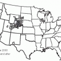
The epidemiologic issue related to place of exposure is often a critical one with the application of GIS. Placing a “case” on a map has significant implications for any viewer of the data, but such conclusions may be incorrect. This is especially true when the place of exposure is unknown. The example of Maxcy’s study4 of murine typhus is a classic example of such a phenomenon. Recently, for example, Kitron et al. examined the risk of LaCrosse encephalitis (LAC) in Illinois.10 This California group encephalitis virus is transmitted by mosquitoes and can produce severe disease, primarily in children. However, most cases are clinically not apparent and the symptoms vary widely, making diagnosis difficult. Consequently, it is difficult to identify where and when cases of LAC are likely to occur. Kitron et al. combined a GIS with spatial analyses to identify clusters of LAC cases, specifically seeking to determine whether regions existed where cases occurred at higher than expected frequencies. Their results showed significant spatial clustering in the state within three counties surrounding Peoria. Demonstration of this clustering then allowed the researchers to investigate which environmental factors occurred within the regions around these sites. Identifying these conditions might permit targeted interventions that would minimize environmental impacts associated with controlling mosquito vectors and eliminate most cases of LAC in the region.
Related posts:

Stay updated, free articles. Join our Telegram channel

Full access? Get Clinical Tree


