Analysis and Interpretation of Surveillance Data
Centers for Disease Control and Prevention, Atlanta, GA, USA
Introduction
Analysis and interpretation of any surveillance data, including infectious disease surveillance data, faces six fundamental challenges. The first challenge is to understand the purpose and context of the specific surveillance system. The second challenge is to identify a baseline rate of observations and to recognize deviations from that baseline, including trends, clusters, and insignificant changes or surveillance artifacts. The third and fourth challenges are to interpret the meanings conveyed by these observations and to recognize the significance of these interpretations. The fifth challenge is to properly discern the degree of certainty that the available data can support regarding that interpretation. The last challenge is to communicate the observations (and the interpretation of their meanings, significance, and certainty) with clarity to the desired audience on a time table that enables meaningful action to be taken in response to the interpreted data.
Infectious disease surveillance is used to detect new diseases and epidemics, to document the spread of diseases, to develop estimates of infection-associated morbidity and mortality, to identify potential risk factors for disease, to facilitate research by informing the design of studies that can test hypotheses, and to plan and assess the impacts of interventions [1]. Surveillance for infectious diseases may focus on entities that are disease specific (e.g., laboratory confirmed Vibrio cholerae bacteria), syndromic (e.g., influenza-like illness), molecular (e.g., genotyping of polio virus [PV] to confirm a vaccine-derived origin), or proxies for the actual entities of interest (e.g., dead birds as a signal of possible West Nile virus spread). Regardless of the entity under observation, infectious disease surveillance involves the ongoing systematic collection, analysis, interpretation, and communication of information in a format that decision makers can easily interpret [1].
The origins of infectious disease surveillance can be traced to efforts by municipalities to enable early warning of decimating plagues. In 1662 in London, John Graunt published an analysis of bills of mortality compiled weekly since 1603. Graunt’s analytic methods consisted primarily of counting and systematically categorizing entries, then comparing categories over defined times. Graunt’s work predated the germ theory and was not a fully developed surveillance system, yet he described the periodicity of infectious diseases and demonstrated the value of converting numbers into rates to characterize the proportionate impact of plagues on a population and the value of contextual information for interpretation of surveillance data. Graunt’s seventeenth century methods (“methids” as he called them) remain basic approaches to analysis and interpretation of infectious disease surveillance data today: (1) count entities and categorize them systematically; (2) when possible, link numerators with denominators to enable recognition of the proportionate impact of disease on populations; (3) examine data within the context of person, place, and time, using uniform time intervals; and (4) evaluate data for missing information or misattribution of cause, for duration of event impact, and for virulence of disease agents [2].
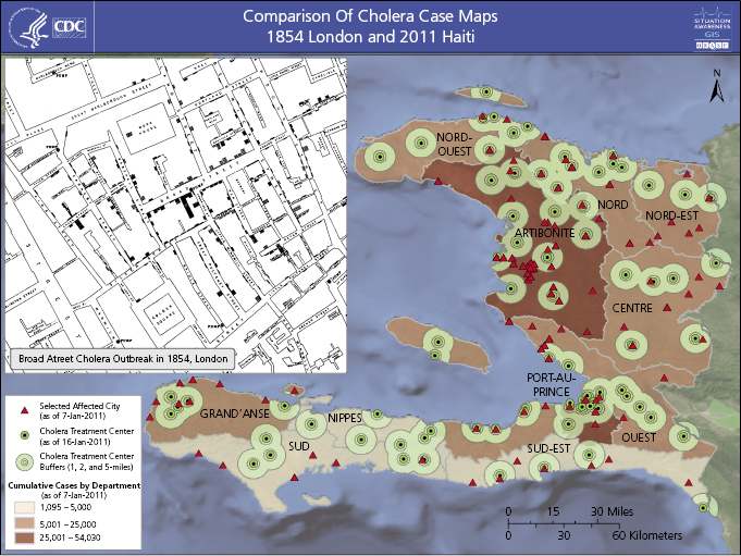
In America, Lemuel Shattuck analyzed Boston’s vital statistics from 1810 to 1841 and proposed a public health infrastructure to gather health statistics at the state and local levels that anticipated modern public health surveillance functions [3–5]. As Superintendent of the General Register Office for England and Wales between 1838 and 1879, William Farr developed a system to routinely record official statistics, including specific causes of death, and compiled a “statistical nosology” which defined fatal disease categories to be used by local registrars. Farr routinely tabulated causes of death by disease, parish, age, sex, and occupation and was the first to compare mortality rates by occupation [6]. Between 1831 and 1866 cholera epidemics killed approximately 40,000 people in London. During these epidemics John Snow mapped the residences of those experiencing cholera deaths, proposed the then-radical hypothesis that people contracted cholera by drinking water contaminated with sewage, and famously interrupted the water supply to the population experiencing the highest mortality rate by removing the Broad Street pump handle (Figure 15.1) [7]. Statistical evidence collected by Farr linked the rate of deaths per thousand population with the water source and documented decreased mortality among customers of a company that relocated its intake above the tidal basin. As a result, public health engineering projects diverted sewage from water sources and ultimately eliminated cholera in industrialized countries [6].
U.S. statutes passed between 1850 and 1880 authorized the quarantine of vessels arriving from foreign ports to prevent epidemics. The 1878 Quarantine Act required publication of weekly international sanitary reports collected through the U.S. consular system [3–5].
Tavern keepers in the pre-Revolutionary American colony of Rhode Island were required to report contagious diseases among their patrons. In 1883, Michigan became the first U.S. state to require statewide reporting of certain infections to health officials [3–5]. Global disease surveillance data became more available when the Health Section of the League of Nations was established in 1923. By 1925, all U.S. states reported the incidence of pellagra and 23 communicable diseases. The United States began publishing domestic morbidity data in 1949 and added mortality data in 1952. During the 1950s and 1960s, the director of epidemiology at what is now the US Centers for Disease Control and Prevention (CDC), Alexander Langmuir, emphasized the use of systematic monitoring of disease in the population to inform action. U.S. national notifiable disease surveillance (see Chapter 3) assisted with elimination of endemic malaria and yellow fever and continues to be applied in disease elimination programs [3]. Langmuir described the basic tasks of the epidemiologist as “to count cases and measure the population in which they arise” [8]. In 1968 he wrote: “The one essential requirement for a surveillance system is a reasonably sophisticated epidemiologist who is located in a central position…who has access to information on the occurrence of communicable diseases…[and] power to inquire into and verify…facts… “ [4].
As germ-theory science and abilities to link disease outcomes to both etiologic agents and risk factors for infection have progressed, analysis and interpretation efforts have become more meaningful and increasingly complex. Yet surveillance remains most effective when it is simplest. The foundation laid by Graunt’s seventeenth century “methids,” the progressive development over the nineteenth and twentieth centuries of systematic data collection and improved data definitions, the addition of mapping as an analytic tool, and the continual twentieth century emphasis on translation of surveillance data into disease-elimination action inform current standards of practice for surveillance analysis and interpretation. Early twenty-first-century innovations attempt to recognize syndromes and aberrations in states of disease when patients first present for care and to move communication of those patterns closer to the time of presentation [9]. Twenty-first-century public health demands technological tools that enable “real-time” information delivery.
Challenge 1: Understand the Purpose and Context of Surveillance Systems
Surveillance data may come from widely different systems with different specific purposes. It is essential that the purpose and context of any specific system be understood before attempting to analyze and interpret the surveillance data produced by that system. It is also essential to understand the methodology by which the surveillance system collects data. Is the data collected actively or passively? Is the surveillance system new or longstanding? Is the surveillance system freestanding or integrated into a larger system of data collection?
Challenge 2: Identify Baselines and Recognize Deviations
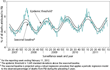
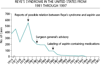
The most fundamental challenge for analysis and interpretation of surveillance data is the identification of a baseline. A baseline identifies the range of the normal or expected rate of occurrence for the entity under surveillance and provides the measure against which changes in status can be recognized. The baseline may be a series of single points but more often encompasses a range of values. For infections characterized by seasonal outbreaks, the baseline range will vary by season in a generally predictable manner as shown for influenza (Figure 15.2) [10]. The comparison of observations to the baseline range allows characterization of the impact of intentional interventions or natural phenomenon and determination of the direction of change. As an example, Reye’s syndrome is a rare, but often fatal, syndrome of pediatric hepatic failure that was associated with common childhood febrile illnesses such as influenza and chickenpox through the 1960s. Figure 15.3 illustrates the progressive impact on the prevalence of Reye’s syndrome in the United States of field investigations that raised suspicion that aspirin use in children might be a risk factor, of publication of a Surgeon General’s advisory recommending against the use of aspirin to treat febrile childhood illnesses, and of regulatory action requiring changes in the labels of aspirin-containing medications (Figure 15.3) [11].
Resource investment in surveillance often occurs in response to a newly recognized disease (e.g., Hantavirus Pulmonary Syndrome in 1993); a suspected change in the frequency, virulence, geography, or risk population of a familiar disease (e.g., introduction of West Nile virus into North America in 1999); or following a natural disaster (e.g., monitoring for gastrointestinal illness among Haitians displaced by the 2010 earthquake). In these situations, no baseline data are available against which to judge the significance of data collected under newly implemented surveillance. Baselines may be altered by changes in surveillance methods or by attention received by a surveillance system (e.g., publicity associated with a high-profile case) which may also alter the number of cases reported to the system. Neither new surveillance methods nor publicity reflect real changes in the state of nature, but both complicate determination of what should constitute the baseline against which apparent deviations are judged for significance. When uncommon entities are under surveillance, what may appear to be erratic variation in incidence may merely reflect the inherent instability of small number observations within a baseline range.
Standardize Observations
A first step in analysis is to assess whether the methods used for data collection were precisely defined and standard throughout data collection. Differences in data collection methods may result in apparent differences in disease occurrence between geographic regions or over time that are merely artifacts resulting from variations in surveillance methodology. Data should be analyzed using standard periods of observation (e.g., by day, week, decade). It may be helpful to examine the same data by varied time frames. An outbreak of short duration may be recognizable through hourly, daily, or weekly grouping of data but obscured if data are examined only on an annual basis. Conversely, meaningful longer-term trends may be recognized more efficiently by examining data on an annual basis or at multiyear intervals.
Ensure Precise Case Definitions
Surveillance systems may collect information on precisely defined or more vaguely defined disease entities. Surveillance design often utilizes case definitions that identify suspected, probable, and confirmed cases. Suspected cases may meet a general syndromic or clinical case definition; probable cases would fulfill the requirements for the suspected case definition plus meet more specifically defined criteria; and confirmed cases would fulfill the requirements for the probable case definition with the addition of the presence of a pathognomonic finding, a positive confirmatory laboratory test or other defining criteria. For example, the World Health Organization cholera case definition of “acute watery diarrhea, with or without vomiting, in a patient aged 5 years or more” might be used as a suspected case definition during a field investigation; the addition of “who resides in an administrative department affected by cholera” might convert it to a probable case; and confirmation of Vibrio cholerae in stool would convert it to a confirmed case. If the surveillance system design has not already categorized data collected in this manner, sorting the observations into suspect, probable, and confirmed cases should be an early step in analysis. Doing so allows analysis of the data as a whole and of the three levels of cases.
Analyze Denominator Data
The meaning and significance of numerator data (e.g., the number of cases of colitis caused by overgrowth of the enteric bacteria Clostridium difficile observed in a municipality this week and the same week 1 year ago) become more clear when numerators can be associated with denominators (e.g., the number of residents of the municipality this week and the same week 1 year ago). A doubling of the number of cases of C. difficile colitis in the municipality over the course of 1 year appears alarming. It ceases to alarm if the population under observation has also doubled, resulting in a stable rate of disease. If the numerator has doubled but the denominator has remained stable, additional contextual observations may be informative. Correlation of this increase with the rate of antibiotic use or the predominant class of antibiotic prescribed may suggest a potential for public health action (i.e., intervention to influence antibiotic prescribing patterns).
An early approach to analysis of infectious disease surveillance data was to convert observation of numbers into observations of rates. Describing surveillance observations as rates (e.g., number of cases of measles per 10,000 population over a defined time period) standardizes the data in a way that allows comparisons of the impact of disease across time and geography and among different populations, which identifies the comparative impact of different infectious agents on a population (e.g., deaths per 10,000 population due to measles compared to the mortality rate per 10,000 from tuberculosis).
Ensure Systematic Presentation
Organization of data into line listings (a list of one observation per line) or tables were approaches used by Graunt in 1662 to describe mortality from plagues [2] and are approaches used by CDC in the U.S. National Notifiable Disease Surveillance System (NNDSS) database in 2012 [12]. Line listings or systematic tables allow characterization of data by temporal occurrence and by number of cases. The percentage change per interval of time can be calculated, and variations in the rate of change can be recognized.
Related posts:
 18: Implementation of the National Electronic Disease Surveillance System in South Carolina
5: Surveillance for Vaccine-Preventable Diseases and Immunization
3: National, State, and Local Public Health Surveillance Systems
8: Surveillance for Foodborne Diseases
17: Infectious Disease Surveillance and Global Security
6: Surveillance for Seasonal and Novel Influenza Viruses
18: Implementation of the National Electronic Disease Surveillance System in South Carolina
5: Surveillance for Vaccine-Preventable Diseases and Immunization
3: National, State, and Local Public Health Surveillance Systems
8: Surveillance for Foodborne Diseases
17: Infectious Disease Surveillance and Global Security
6: Surveillance for Seasonal and Novel Influenza Viruses
Stay updated, free articles. Join our Telegram channel

Full access? Get Clinical Tree


