Fig. 4.1
The main steps of evaluation
Comparison of a new algorithm to other (may be generic or application-specific) classifiers on a specific domain (e.g., when proposing a novel learning algorithm)
Comparison of a new generic algorithm to other generic ones on a set of benchmark domains (e.g., to demonstrate general effectiveness of the new approach against other approaches)
Characterization of generic classifiers on benchmarks domains (e.g., to study the algorithms’ behavior on general domains for subsequent use)
Comparison of multiple classifiers on a specific domain (e.g., to find the best algorithm for a given application task)
To better illustrate the difficulties of making the appropriate choices at each step, we look at an example involving the choice of an appropriate performance measure. Table 4.1 shows the performance obtained by eight different classifiers (naive Bayes [NB], C4.5, three-nearest neighbor [3NN], ripper [Rip], support vector machines [SVM], bagging [Bagg], boosting [Boost], random forest [RF]) on a given data set (the UCI breast cancer data set [2]) using nine different performance measures (accuracy [Acc], root-mean-square error [RMSE], true positive rate [TPR], false positive rate [FPR], precision [Prec], recall [Rec], F-measure [F], area under the ROC curve [AUC], information score [Info S]). As can be seen from the table, each measure tells a different story. For example, accuracy ranks C4.5 as the best classifier for this domain, while according to the AUC, C4.5 is the worst classifier (along with SVM, which accuracy did not rank highly either). Similarly, the F-measure ranks naive Bayes in the first place, whereas it only reaches the 5th place as far as RMSE is concerned. This suggests that one may obtain very different conclusions depending on what performance measure is used. Generally speaking, this example points to the fact that classifier evaluation is not an easy task and that not taking it seriously may yield grave consequences.
Table 4.1
The performance of eight different classifiers according to nine different performance measures. There is clear disagreement among the evaluation measures
Algo | Acc | RMSE | TPR | FPR | Prec | Rec | F | AUC | Info S |
|---|---|---|---|---|---|---|---|---|---|
NB | 71.7 | .4534 | .44 | .16 | .53 | .44 | .48 | .7 | 48.11 |
C4.5 | 75.5 | .4324 | .27 | .04 | .74 | .27 | .4 | .59 | 34.28 |
3NN | 72.4 | .5101 | .32 | .1 | .56 | .32 | .41 | .63 | 43.37 |
Ripp | 71 | .4494 | .37 | .14 | .52 | .37 | .43 | .6 | 22.34 |
SVM | 69.6 | .5515 | .33 | .15 | .48 | .33 | .39 | .59 | 54.89 |
Bagg | 67.8 | .4518 | .17 | .1 | .4 | .17 | .23 | .63 | 11.30 |
Boost | 70.3 | .4329 | .42 | .18 | .5 | .42 | .46 | .7 | 34.48 |
RanF | 69.23 | .47 | .33 | .15 | .48 | .33 | .39 | .63 | 20.78 |
The next section looks at performance measures in more detail, while the next two sections will discuss resampling and statistical testing.
4.3 Performance Measures
Figure 4.2 presents an overview of the various performance measures commonly used in machine learning. This overview is not comprehensive, but touches upon the main measures. In the figure, the first line, below the “all measures” box indicates the kind of information used by the performance measure to calculate the value. All measures use the confusion matrix, which will be presented next, but some add additional information such as the classifier’s uncertainty or the cost ratio of the data set, while others also use other information such as how comprehensible the result of the classifier is or how generalizable it is, and so on. The next line in the figure indicates what kind of classifier the measure applies to deterministic classifiers, scoring classifiers, or continuous and probabilistic classifiers. Below this line comes information about the focus (e.g., multiclass with chance correction), format (e.g., summary statistics), and methodological basis (e.g., information theory) of the measures. The leaves of the tree list the measures themselves.
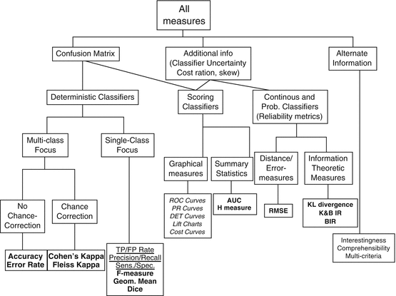

Fig. 4.2
An overview of performance measures
As just mentioned, all the measures of Fig. 4.2 are based on the confusion matrix. The template for a confusion matrix is given in Table 4.2:
Table 4.2
A generic confusion matrix
True class → hypothesized|class V | Pos | Neg |
|---|---|---|
Yes | TP | FP |
No | FN | TN |
P = TP + FN | N = FP + TN |
TP, FP, FN, and TN stand for true positive, false positive, false negative, and true negative, respectively. Some common performance measures calculated directly from the confusion matrix are:
Accuracy = (TP + TN)/(P + N)
Precision = TP/(TP + FP)
Recall, sensitivity, or true positive rate = TP/P
False alarm rate or false positive rate = FP/N
For a more comprehensive list of measures including sensitivity, specificity, likelihood ratios, positive and negative predictive values, and so on, please refer to [1].
We now illustrate some of the problems encountered with accuracy, precision, and recall since they represent important problems in evaluation. Consider the confusion matrices of Table 4.3. The accuracy for both matrices is 60 %. However, the two matrices t classifiers with the same accuracy account for two very different classifier behaviors. On the left, the classifier exhibits a weak positive recognition rate and a strong negative recognition rate. On the right, the classifier exhibits a strong positive recognition rate and a weak negative recognition rate. In fact, accuracy, while generally a good and robust measure, is extremely inappropriate in the case of class imbalance data, such as the example, mentioned in Sect. 4.2 where there were only very few instances of X-rays containing malignant tumors and many instances containing benign ones. For example, in the extreme case where, say, 99.9 % of all the images would not contain any malignant tumors and only 0.1 % would, the rough classifier consisting of predicting “benign” in all cases would produce an excellent accuracy rate of 99.9 %. Obviously, this is not representative of what the classifier is really doing because, as suggested by its 0 % recall, it is not an effective classifier at all, specifically if what it is trying to achieve is the recognition of rare, but potentially important, events. The problem of classifier evaluation in the case of class imbalance data is discussed in [3].

Table 4.3
The confusion matrices of two very different classifiers with the same accuracy

Table 4.4 illustrates the problem with precision and recall. Both classifiers represented by the table on the left and the table on the right obtain the same precision and recall values of 66.7 and 40 %. Yet, they exhibit very different behaviors: while they do show the same positive recognition rate, they show extremely different negative recognition rates; in the left confusion matrix, the negative recognition rate is strong, while in the right confusion matrix, it is nil! This certainly is information that is important to convey to a user, yet, precision and recall do not focus on this kind of information. Note, by the way, that accuracy which has a multiclass rather than a single-class focus has no problem catching this kind of behavior: the accuracy of the confusion matrix on the left is 60 %, while that of the confusion matrix on the right is 33 %!

Table 4.4
The confusion matrices of two very different classifiers with the same precision and recall

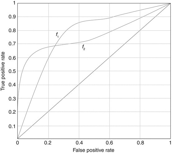
Because the class imbalance problem is very pervasive in machine learning, ROC analysis and its summary measure and the area under the ROC curve (AUC), which do not suffer from the problems encountered by accuracy, have become central to the issue of classifier evaluation. We now give a brief description of that approach. In the context of the class imbalance problem, the concept of ROC analysis can be interpreted as follows. Imagine that instead of training a classifier f only at a given class imbalance level, that classifier is trained at all possible imbalance levels. For each of these levels, two measurements are taken as a pair, the true positive rate (or sensitivity) and the false positive rate (FPR) (or false alarm rate). Many situations may yield the same measurement pairs, but that does not matter since duplicates are ignored. Once all the measurements have been made, the points represented by all the obtained pairs are plotted in what is called the ROC space, a graph that plots the true positive rate as a function of the false positive rate. The points are then joined in a smooth curve, which represents the ROC curve for that classifier. Figure 4.3 shows two ROC curves representing the performance of two classifiers f1 and f2 across all possible operating ranges.
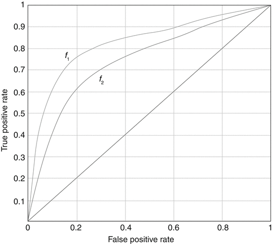

Fig. 4.3
The ROC curves of two classifiers f1 and f2. f1 performs better than f2 in all parts of the ROC space
The closer a curve representing a classifier f is from the top-left corner of the ROC space (small false positive rate, large true positive rate), the better the performance of that classifier. For example, f 1 performs better than f 2 in the graph of Fig. 4.3. However, the ideal situation of Fig. 4.3 rarely occurs in practice. More often than not, one is faced with a situation such as that of Fig. 4.4, where one classifier dominates the other in some parts of the ROC space, but not in others.
